More on the Proficiency Rates for NYC Students
This article elaborates on to my earlier article, “Let’s Not Be Fooled by De Blasio’s “Solution” to Diversity Problem in Elite NYC High Schools.”
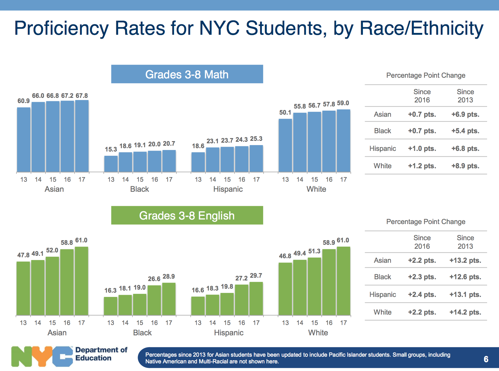
A few people have argued that my interpretation of the DOE chart of academic proficiency rates is wrong because it does not take into account the size and distribution of each racial category. Here is my response to that.
Firstly, the proficiency rates are what they are. It’s true that the sheer number of students could potentially make up for the deficiency but we are not going to say the problem is solved because of that. The racial disparity is a huge problem that needs to be fixed, and it would be too disingenuous to say that the glaring racial disparities in 3-8 grades have no correlation to the racial compositions of the SHSAT schools. The only question that the chart cannot answer (because we don’t have access to full data) is to what degree they are correlated.
It’s not just at the SHSAT schools that we see black/Hispanic students underrepresented. Here are the racial compositions of top “Screened” schools.
- Eleanor Roosevelt High School
Asian: 17%, Black: 3%, Hispanic: 12%, White: 64% - Baruch College Campus High School
Asian: 39%, Black: 5%, Hispanic: 13%, White: 40% - Millennium (Manhattan):
Asian: 45%, Black: 5%, Hispanic: 13%, White: 31% - Bard Queens
Asian: 34%, Black: 11%, Hispanic: 19%, White: 34% - Beacon High School
Asian: 9%, Black: 14%, Hispanic: 19%, White: 50% - Bard Manhattan
Asian: 28.4%, Black: 14%, Hispanic: 17%, White: 39%
Bard has their own test which is different from SHSAT. Millennium has no test or interview; they only look at other objective criteria: attendance, course grades, and Common Core tests. Regardless of the selection criteria, we still see the same underrepresentation of black and Hispanic students.
Let’s now review and compare the SHSAT schools.
- Stuyvesant
Asian: 74%, Black: 1%, Hispanic: 3%, White: 18% - Bronx High School of Science:
Asian: 66%, Black: 3%, Hispanic: 6%, White: 23% - Brooklyn Technical High School
Asian: 61%, Black: 6%, Hispanic: 7%, White: 23% - Brooklyn Latin School
Asian: 51%, Black: 13%, Hispanic: 11%, White: 14%
What we see is that as we go down in the academic ranking of these high schools, we begin to see more black and Hispanic students, and SHSAT or “Screened” makes no difference. The underrepresentation is consistent across all top schools, not an exclusive symptom of the SHSAT.
Now, let’s dig even deeper because the spreadsheet available from DOE provides more details. The DOE chart is taking the data for “All Grades” from 3 to 8. For high school admissions, the grade that counts the most is 7th grade. (By the time the students take the 8th grade tests, they are already assigned to high schools. And, in 8th grade, the students are not motivated to perform well on tests since they no longer matter for high school admissions.) As you can see, the DOE chart is taking the numbers from Level 3 and 4 combined.
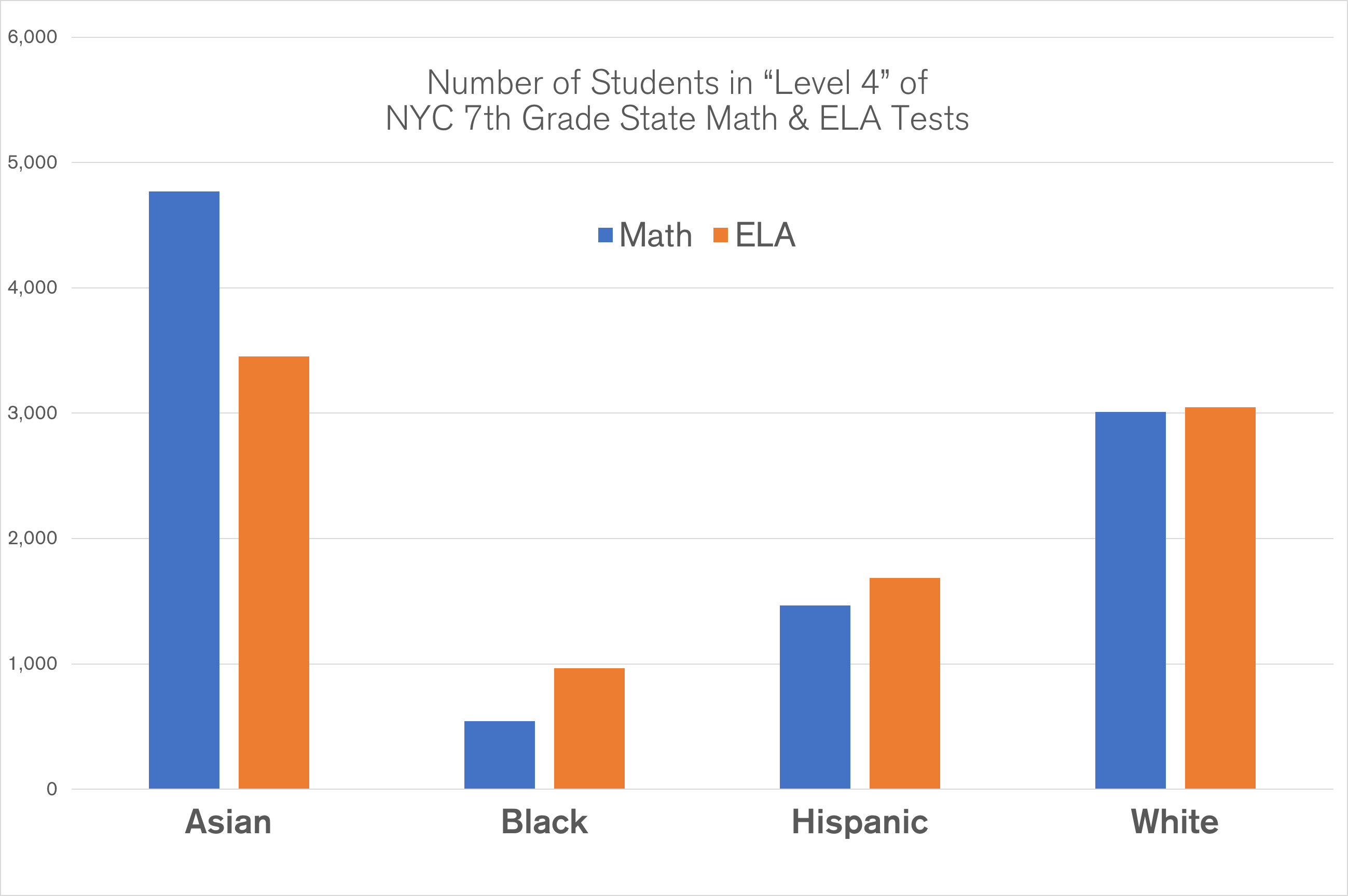
Since we are talking about the top high schools, and since we have access to the data at Level 3 and 4 separately, we should now look at Level 4 only to see what the racial proportions look like.
Asian: 48.7%
Black: 5.5%
Hispanic: 15.0%
White: 30.8%
We have 20.5% for black/Hispanic students.
In contrast, here is what Level 3 and 4 combined looks like:
Asian: 36.5%
Black: 11.3%
Hispanic: 25.2%
White: 27.0%
So, clearly, what happens is that the higher the proficiency, the more Asians/white students and less black/Hispanic students we see. If we were to subdivide Level 4 (i.e. we look at the top and bottom halves of Level 4 students), we should continue to see this trend. If we look at Stuyvesant (the highest ranking high school based on the average SAT scores) we should expect to see even less black/Hispanic students. As we look at other SHSAT schools that are ranked lower, we do begin to see higher representations of black/Latino students.
In 2017, Stuyvesant had 814 seats available for new students. In Level 4, there were 10,058 students for math and 9,441 students for ELA. That is, you have to be in the top 8% of Level 4 to get into Stuyvesant, and top 1% of all public school students citywide. The combined number of seats for Stuyvesant, Brooklyn Tech, and Bronx Science was 2,964 (again, there were roungly 10,000 students in Level 4), so only 30% of Level 4 students were offered seats at these three big schools.
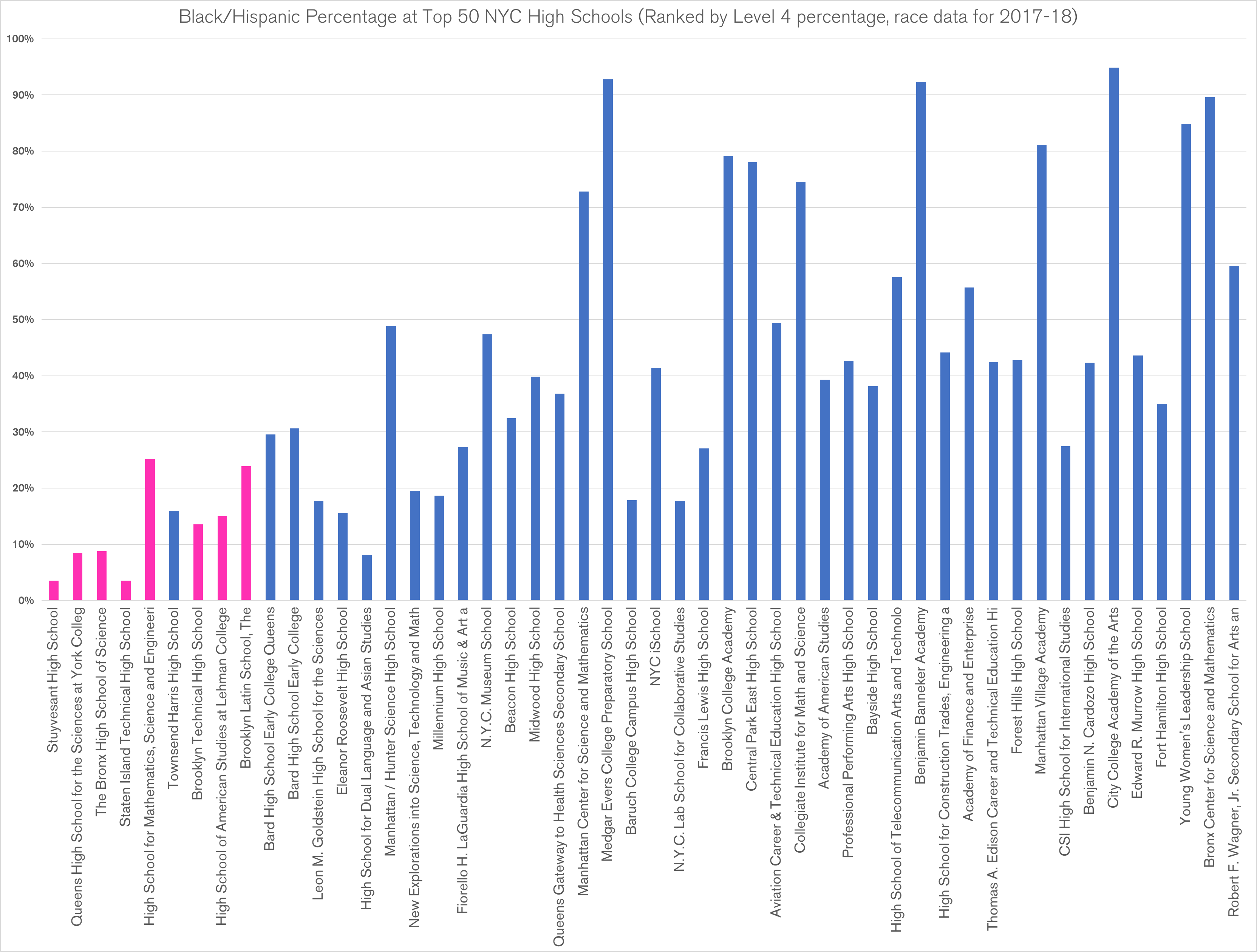
Below is a chart that shows the black/Hispanic percentage at the top 50 NYC high schools ranked by the percentage of Level 4 students. (For instance, 97% of the students who were accepted to Stuyvesant were in Level 4.) The pink columns are the SHSAT schools. As you can see, what we observe is expected and blends in with the screened schools. The extremely low percentages of black/Hispanic students at the top SHSAT schools are justified because the percentage continually declines as we go up in proficiencies. SHSAT appears to select the students by proficiency just as the screened schools do.
Therefore, it’s reasonable to conclude that the proficiency rates shown in the DOE chart have a significant degree of correlation to the selection results at all top high schools including SHSAT and “Screened.” If selecting students based on proficiency is unfair, all top schools should be criticized as “unfair.” It is unfair to attack only the SHSAT schools.
Subscribe
I will email you when I post a new article.


