What Google’s Smartphone Data Tell Us About COVID-19 Infection Rates
Google published the data that show the decline in activities at key locations from February 23 to April 5, 2020. They have these data because they have a statistically significant pool of Android smartphone users, and are able to see how people moved.
The locations they tracked are “retail & recreation” (restaurants, cafes, shopping centers, theme parks, museums, libraries, and movie theaters), “grocery & pharmacy” (grocery markets, food warehouses, farmers markets, specialty food shops, drug stores, and pharmacies), “parks” (national parks, public beaches, marinas, dog parks, plazas, and public gardens), “transit stations” (public transport hubs such as subway, bus, and train stations), “workplace,” and “residential.”
I was curious to see how different boroughs in New York City responded to the shelter-in-place order. We would expect the number of people at the first five locations to decline, and the last one, “residential,” to increase. As expected, the activity levels did significantly dip but not equally. I created a chart that would allow us to see how each NYC borough behaved.
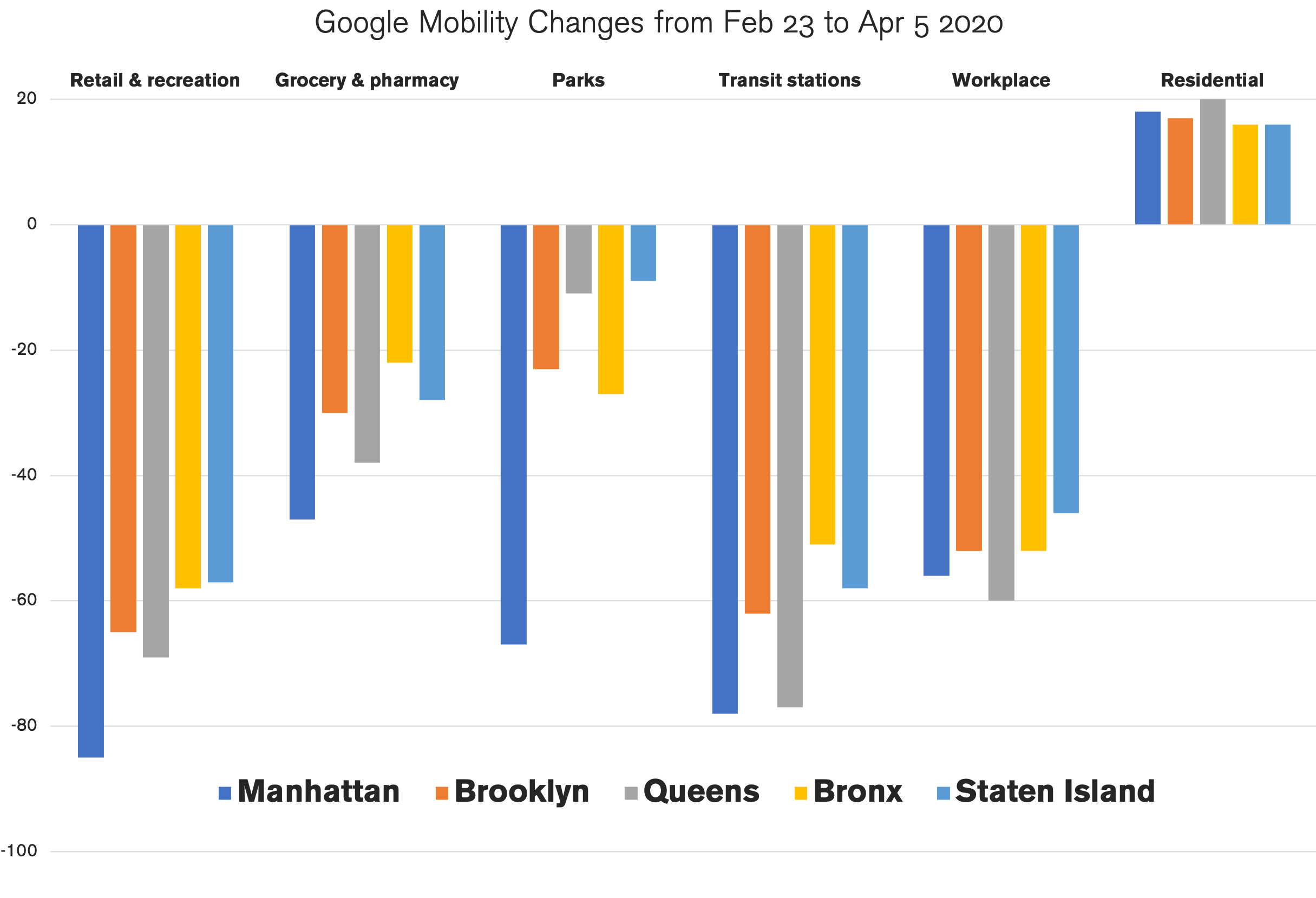
The lower the columns are, the better. Negative 100% would mean nobody visited these areas. Negative 20% would mean a 20% decline from the baseline level recorded between January 3 to February 6, 2020. This, in essence, allows us to see how seriously people in different boroughs adhered to the shelter-in-place order.
I added the percentages for each borough (the number for “residential” was reversed because a positive number means stricter adherence) to function as an adherence score and created a chart below. For reference, I also added a median income for each borough.
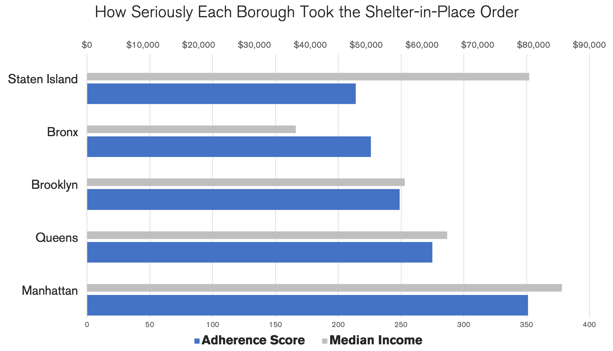
Manhattan scored the highest and, interestingly, Staten Island scored the lowest. Now, let’s think about what this could mean.
Take a look at the chart below published by NYC. These are the infection rates by borough. Bear in mind that these are rates, not the total numbers. What they allow us to see is the probability of getting infected if you lived in one of these boroughs.
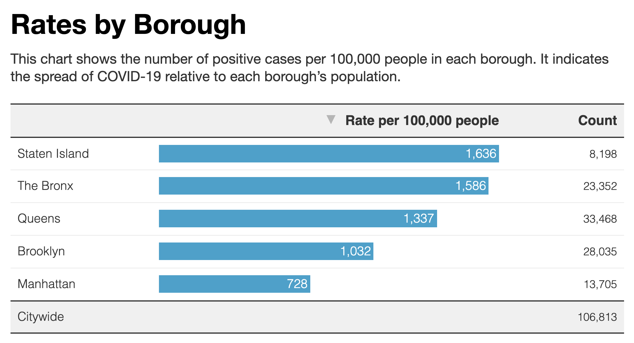
Interestingly, the order is the same except that Queens and Brooklyn have swapped their positions. This seems to imply that how well people adhered to the social distancing measures had a clear impact on infection rate.
Here are some more observations:
Staten Island had a high infection rate despite the fact that it is the most spacious borough. (In roughly the same amount of space, Staten Island has 476,143 people whereas Brooklyn has 2,533,000—1 to 5 ratio.) This implies that density is not a significant factor.
This also implies that race as a biological factor is not relevant, as Staten Island is predominantly white (77.6%). Behavior matters more.
Parks are the least essential place to visit, but in Queens and Staten Island, the activity levels did not change much from normal times. What we want to know here is how seriously each borough took the shelter-in-place order to heart. It’s not so much about how risky these places are. However, regardless of how much space you might have from other people, there are certain hotspots within any area where people converge. In parks, they are benches, water fountains, bathrooms, gates, and so on. If you pick a random spot within a large park, the probability of two people walking over it is very small, but if you pick a bench, the probability would dramatically increase. The fact that parks are spacious can lead to a false sense of security.
For transit use, we do not see much difference between Manhattan and Queens. The Queens residents seem to have stopped using public transportation at the same rate Manhattan residents did.
The idea that poverty is an influential factor for infection rate is not supported by this data set as Staten Island has the second-highest median income after Manhattan. It is also contradicted by the fatality rate by race.
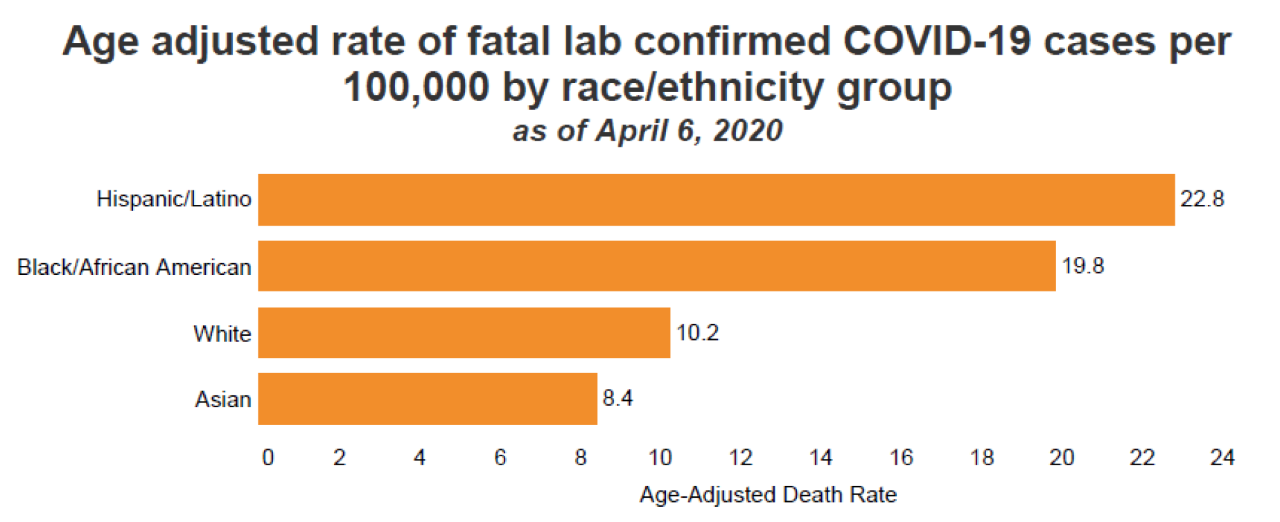
In New York City, Asians have the highest poverty rate. 24.1% for Asian, 23.9% for Hispanic, 19.2% for black, and 13.4% for white. If poverty was a major factor, Asians would have the highest fatality rate.
Furthermore, New York Times says, “in Minnesota, black people have been infected with the coronavirus at rates roughly proportionate to their percentage of the state’s population.” This is in spite of the fact that Minnesota has one of the worst racial inequalities in the whole country.
From my perspective, what these data show is that behavior is the most influential factor. New York City is highly segregated, not only in terms of race, but also in terms of culture, although they are closely related. For instance, even though Staten Island (77.6%) and Manhattan (54.4%) are two of the most white-dominant boroughs, in terms of infection rates, they are at the opposite ends. The culture in Staten Island is indeed quite distinct.
In late February and early March, when the virus was silently spreading, not many people were taking precautions. Keeping six feet away from others, not shaking hands, and wearing a mask were entirely new behaviors to most New Yorkers, but we had to adopt them almost overnight. Because these behaviors are visible, they felt awkward for most people. Many people waited until others began adopting them, which means these behaviors were collective, not so much individual. Subtle cultural differences must have played a significant role.
For instance, many Asians are comfortable with the idea of wearing masks and not shaking hands. For the Latino community, like for Italians, it may have been harder to stop hugging each other as they tend to be more physically expressive than Asians. Within the black community, there was a rumor that black people cannot contract the coronavirus and some black men are afraid of wearing masks for fear of being racially profiled by the police. And, even within each race, there are many different subgroups with different cultures. For instance, the immigrant generation and the second generation tend to behave differently. White-collar whites and blue-collar whites tend to behave differently also.
As we get more data from the current crisis, we’ll likely get a clearer picture of what caused the difference in infection rates. I’ll be updating my analysis as I receive them.
Subscribe
I will email you when I post a new article.